Simplify Search Result Page
2024 · Internal Project
Team: Microsoft AI Brand & Design Systems
Role: Product designer — UX/UI, Design Systems
Problem
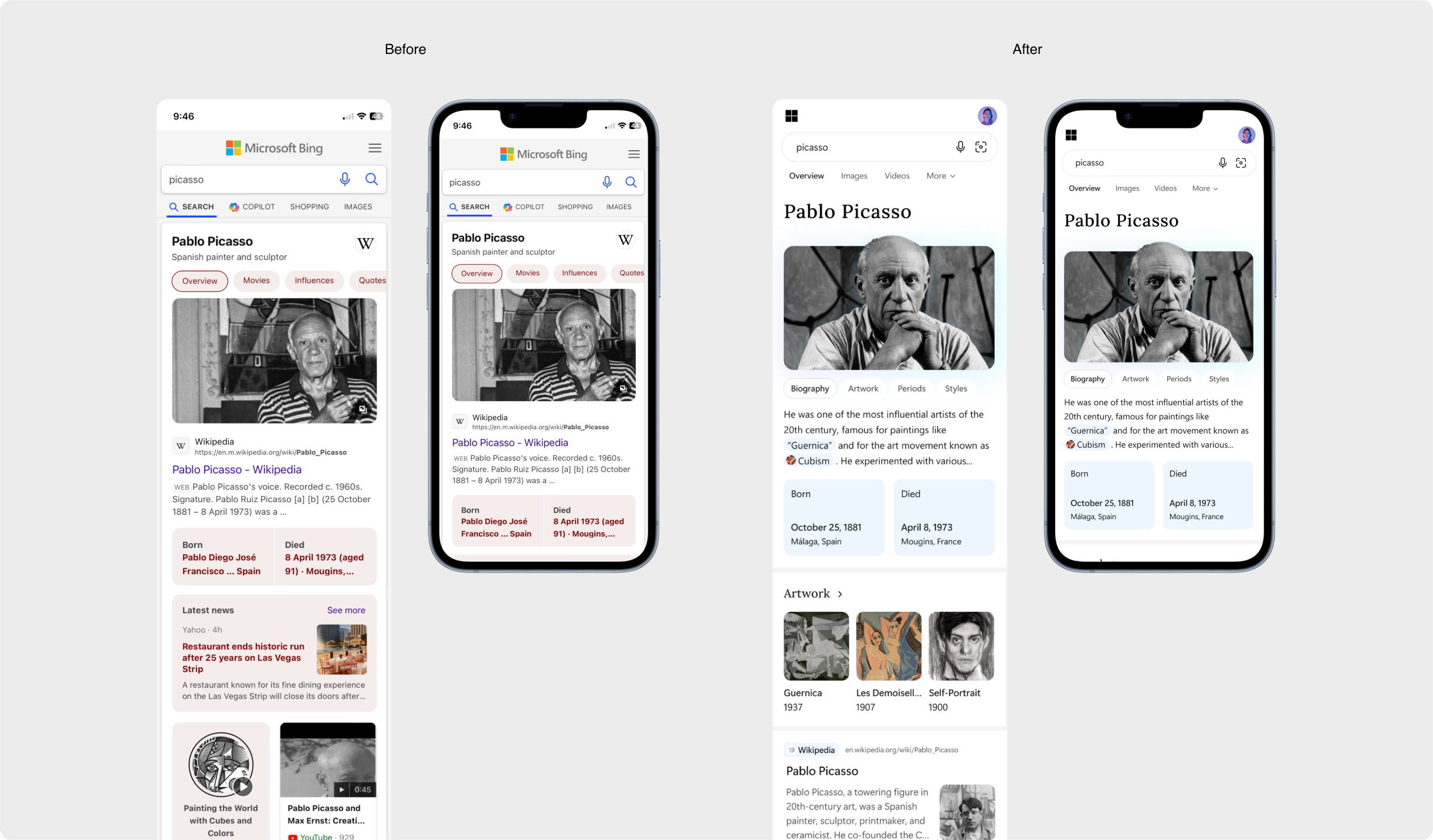
The Bing search results page is owned by multiple teams, which led to a fragmented design system and an overly dense interface. User research revealed that people struggled to focus, felt overwhelmed by the number of elements, and were easily distracted.

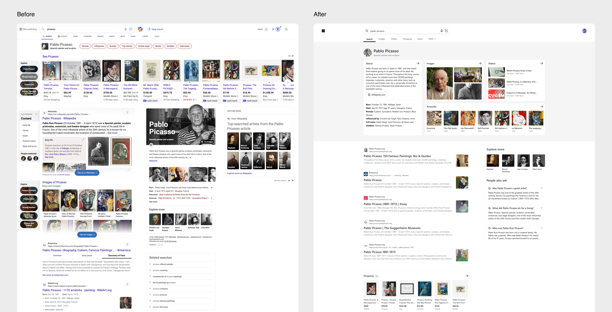
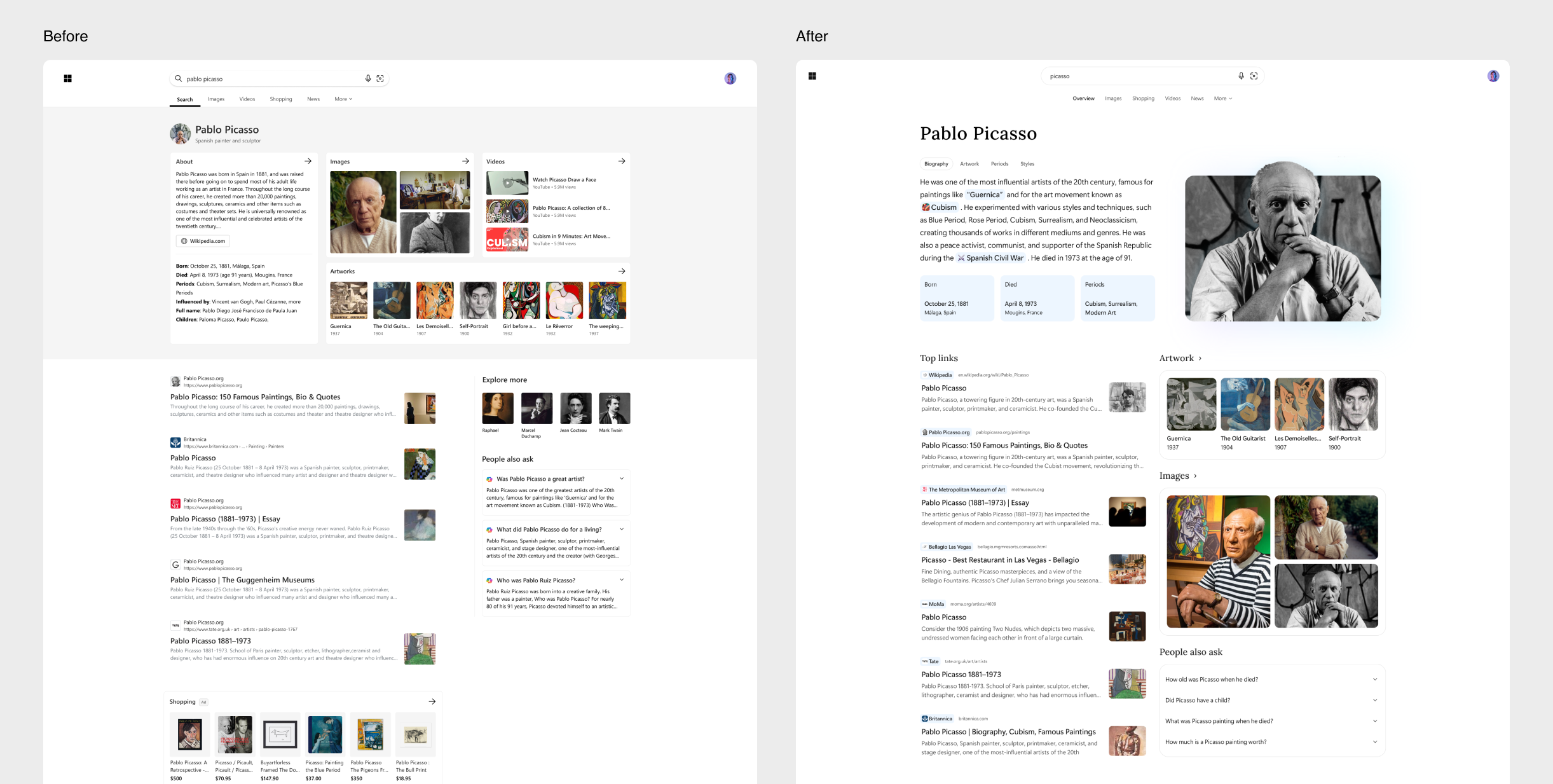
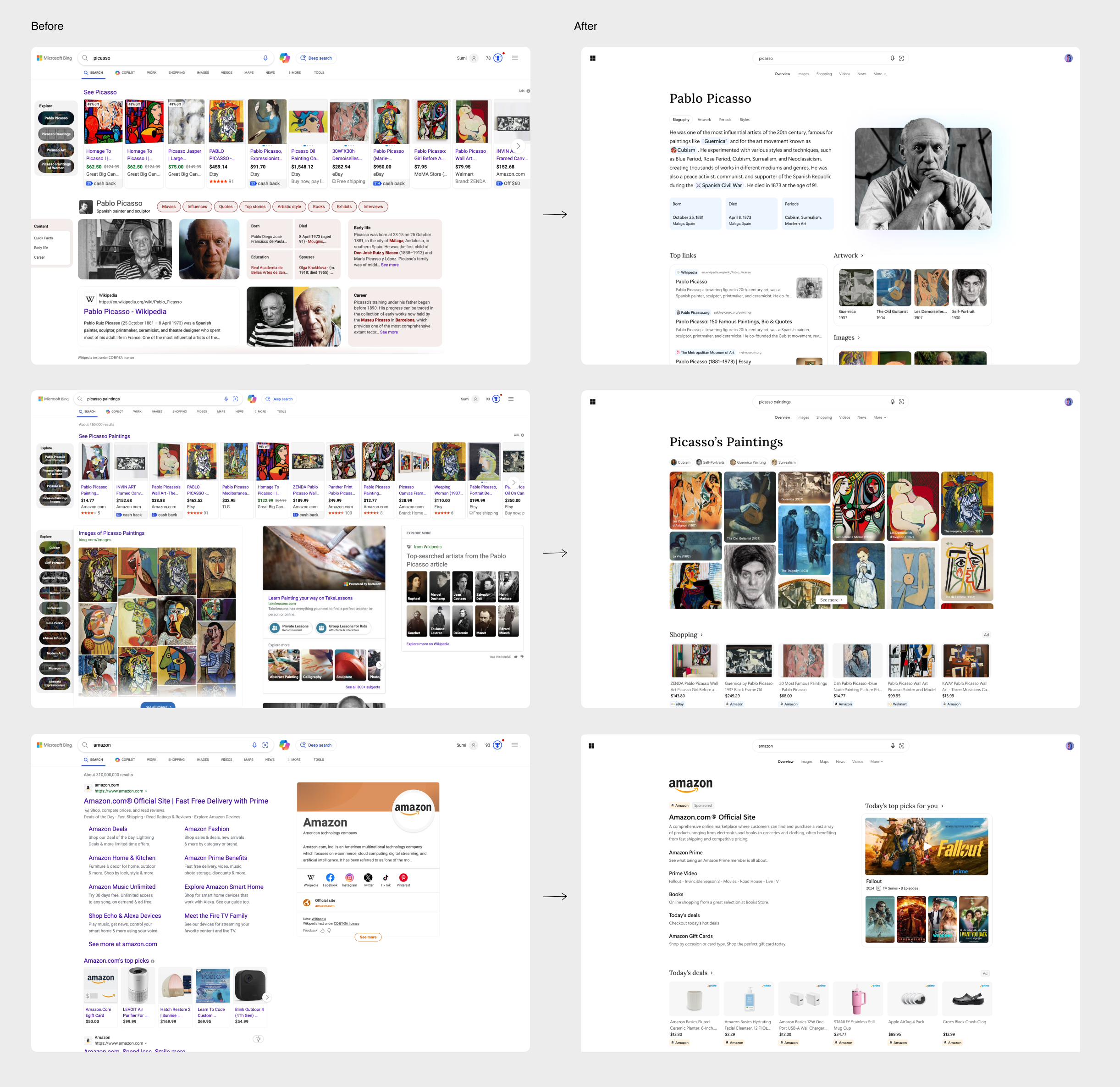
Current Experience
Design Approach
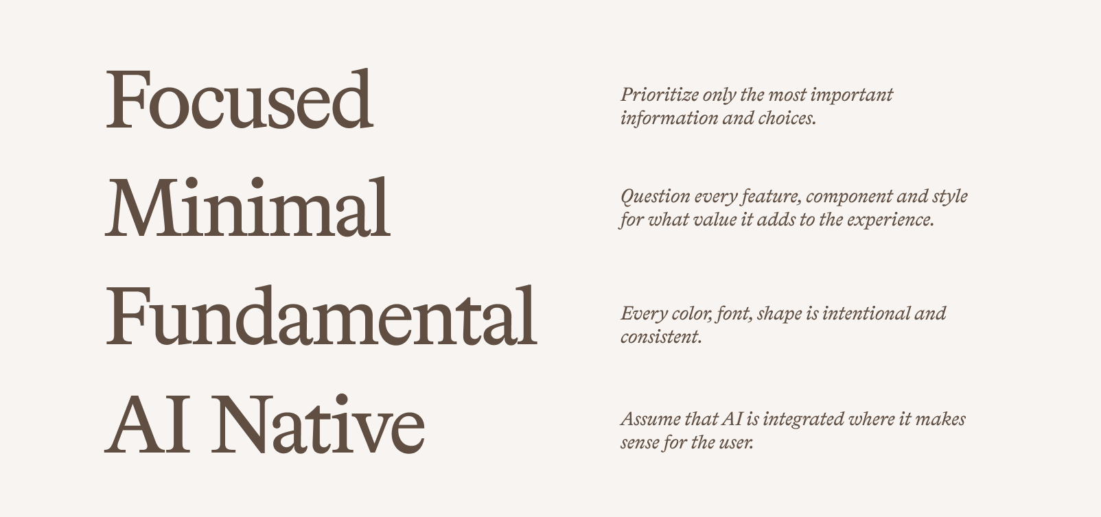
01. Simplify UI
The first step, the crawl phase, focused on simplifying the existing UI by unifying it under a single design system. We aligned all elements to a consistent grid, removed unnecessary components, and established a clear visual hierarchy to improve focus.
02. Evolve Brand Language
After simplifying the UI, we identified an opportunity to evolve the experience by introducing brand expression in a controlled way. This approach strengthens brand recognition and engagement without distracting users from their primary tasks.
Design System
We created a unified design system and component library to ensure visual consistency and enable scalable adoption across the platform.
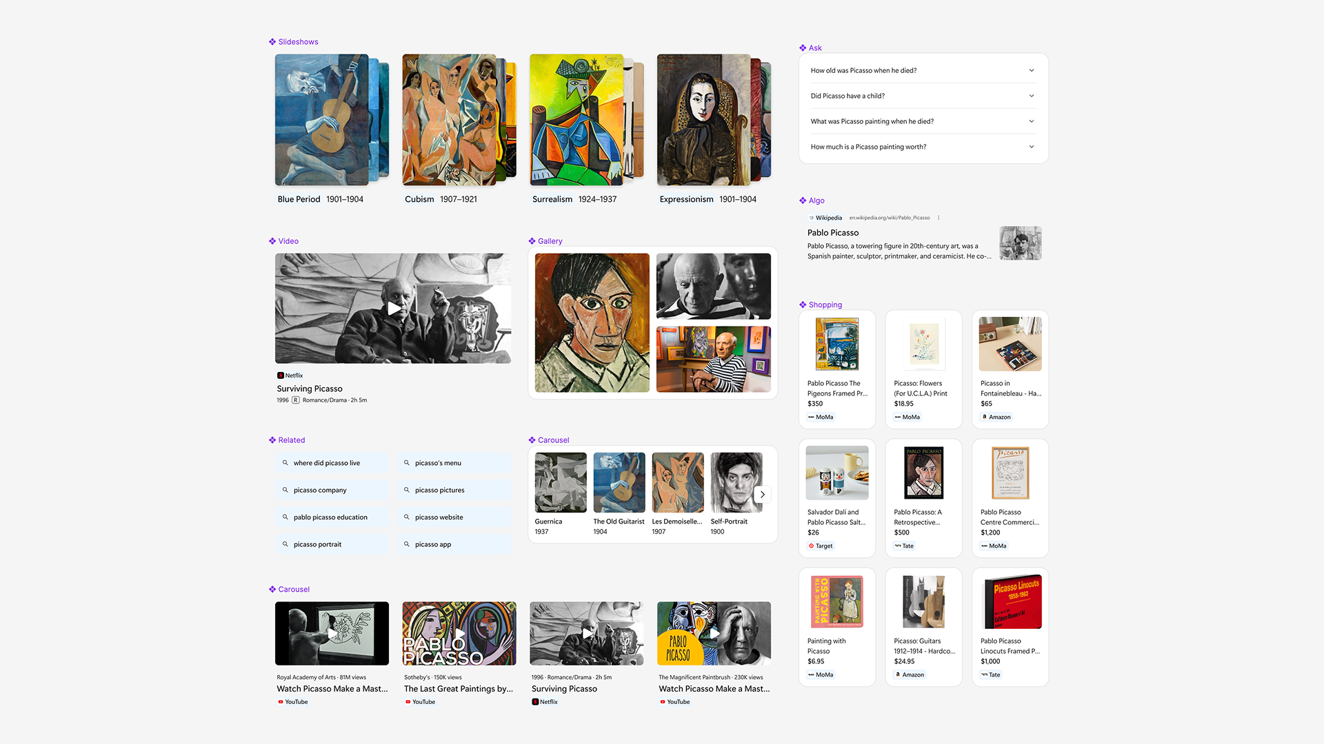
Other Opportunities
Beyond structural improvements, motion offers a powerful way to elevate the search experience. Subtle transitions and hover interactions can reinforce brand expression while adding moments of delight, helping the interface feel more dynamic and engaging.